We
were sitting in lesson thinking about what we could feature in our title
sequence and as our plot had to do with an orphanage burning down we all came
up with the idea that we could order or buy an old looking dolls house that we
would then be able to burn down so that it could be featured in our title
sequence, so that weekend I went out and tried looking for the type of dolls
house that fitted what we wanted to feature in our title sequence but sadly had
no luck with doing so. We then went online and started search for a wooden
dolls house and we then found one on amazon so we all put money into it and
ordered it so that we could then use the opportunity in class to build it.
Friday, 30 November 2012
Thursday, 29 November 2012
Thursday, 22 November 2012
Saul Bass
Saul Bass was a graphic designer and filmmaker, perhaps best known for
his design of film posters and motion picture title sequences. Saul Bass collaborated with Alfred
Hitchcock, Otto Preminger and Martin Scorsese. He became well known after
creating the title sequence for Otto Preminger's The Man with the Golden
Arm (1955). For Alfred Hitchcock, Bass provided effective, memorable
title sequences, inventing a new type of kinetic typography. Bass
once described his main goal for his title sequences as being to ‘’try to reach
for a simple, visual phrase that tells you what the picture is all about and
evokes the essence of the story.
He designed title sequences for more than 40 years, and
employed diverse film making techniques, from cut out animation for Anatomy of a Murder (1958),
to fully animated mini-movies such as the epilogue for Around the World
in 80 Days (1956), and live action sequences. Best known for his simple, geometric shapes and their symbolism, he studied at the art students legue in manhattan. Bass's posters had an uncanny ability, all hos work was often hand written they are always packed with a sophisticated message.
(Research on his life)
·
1920 Saul Bass is born in the Bronx district of New
York
·
1936 Wins a scholarship to study at the Art Students' League in Manhattan
·
1938 Employed as an assistant in the art department of the New York office of
Warner Bros
·
1944 Joins the Blaine Thompson Company, an advertising agency, and enrolls at
Brooklyn College, where he is taught by the émigré Hungarian designer and
design theorist Gyorgy Kepes
·
1946 Moves to Los Angeles to work as an art director at the advertising agency,
Buchanan and Company
·
1952 Opens his own studio, named Saul Bass & Associates in 1955
·
1954 Designs his first title sequence for Otto Preminger’s Carmen Jones
·
1955 Creates titles for Robert Aldrich’s The Big Knife and Billy Wilder’s The
Seven Year Itch. The animated sequence he devises for Preminger’s The Man with
a Golden Arm causes a sensation
·
1956 Elaine Makatura joins the studio as an assistant
·
1957 Devises titles for Michael Anderson’s Around The World in 80 Days and
Preminger’s Bonjour Tristesse
·
1958 Forges a new collaboration with Alfred Hitchcock by designing the titles
for Vertigo. Works with the architects Buff, Straub & Hensman on the design
of his home, Case Study House #20 in Altadena
·
1959 Creates the title sequences for Hitchcock’s North by Northwest and
Preminger’s Anatomy of a Murder
·
1960 First title commission for Stanley Kubrick, Spartacus, and the last for
Hitchcock, Psycho
·
1962 Devises titles for Edward Dmytryk’s Walk on the Wild Side and directs
his first short film, Apples and Oranges. Marries Elaine Makatura
·
1963 Stanley Kramer commissions Bass to create titles for It’s A Mad, Mad,
Mad, Mad World
·
1966 Directs the racing sequences and devises the titles for John
Frankenheimer’s Grand Prix
·
1968 Wins an Oscar for the short film Why Man Creates and develops a
corporate identity programme for the Bell System telephone company. Creates an
installation for the Milan Triennale, which is cancelled after a student
occupation
·
1973 Designs the corporate identity of United Airlines
·
1974 Directs his first feature film Phase IV
·
1980 Designs the poster for Stanley Kubrick’s The Shining and devises the
corporate identity of the Minolta camera company
·
1984 Creates a poster for the Los Angeles Olympic Games
·
1987 James L. Brooks persuades Bass to return to title design by creating the
opening sequence of Broadcast News
·
1990 Begins a long collaboration with Martin Scorsese by creating the titles
for GoodFellas
·
1991 Devises the titles for Scorsese’s Cape Fear and a poster for the 63rd
Academy Awards. Bass designs the Academy Awards poster for the next five years.
·
1993 Creates the title sequence for Scorsese’s The Age of Innocence and a
poster for Steven Spielberg’s Schindler’s List
·
1995 Designs titles for Scorsese’s Casino
·
1996 Saul Bass dies in Los Angeles of non-Hodgkins lymphoma
Zombieland
-->
In the opening sequence to Zombieland we see that the
zombies are attacking people on a their normal day to day lives. It is all in
slow motion and you can see the reaction on the peoples faces whilst they are
running away from the zombies, there is
heavy rock music playing in the background to make the audience see that the
zombies are rebellious. The first shot is of a man in a prison outfit chucking
the prison guard off of the platform this shows that the law is out of control,
this is showing us that the setting is based in America as of the type of
clothing the in mate is wearing. The typography used in the sequence is being
destroyed. As soon as we get an insight of what the film is going to be about
we straight away know that the genre is going to be horror as the zombie is
shown. In the shot of the two men
running away from the burning down car there is money being thrown into the
air, this shows that money means nothing anymore its all about survival. The
more into the sequence we get we are able to see the facial expressions of the
people running away you can see that they are scared. There is abnormal
creatures causing havoc and acting reckless in everyone’s hometown. The rock music
is consistent throughout the sequence this is showing us the rebellion of the
zombies. Also there is a homeless guy standing with a sign on saying that ‘the
end is near’ this could be a sign of comedy usually people would walk past and
not listen to what they say but knowing that the town is being taken over by
zombies they are now thinking ‘we should of listened to that guy’ the font
seems to move whenever the zombies attack the actor.
We then get a close up of the zombies attacking a police
officer this shows the audience that the zombies do not care about how high up
they are in the world they will do what they want and kill. We see a lot of
shots of people just getting attacked by the zombies when they haven’t done
anything, they’re just getting on with there day to day lives and they then get
attacked by a zombie.
Sound Design, Codes And Conventions.
Sound Design
- Sound track
- Wildtrack
- Dialogue
- Foley track
- Non-digetic (sound track for audience)
- Digetic (sound track characters can hear)
The creation and layering of dialogue, background noise and other sound effects to create a sophisticated aural environment.
Key designs:
- Realism
- Hyper realism
- Un realism/ Surrealism
STINCS
Theme: Mood of the film and what its really about, e.g; love, jealousy and voyeurism
Narrative: What the story is about
Characters: Who they are? What are they like? (Principals, Antagonists, Protagonist)
Style: Cinematography, sound, editing. What the feel ill look and feel like.
Codes and conventions of an opening sequence:
- The films title
- An introduction to character or character type.
- Indiction of place.
- Introduction to signature theme tune -Leitmotif.
- Indiction of historical period.
- Information regarding mood and tone.
- Information about genre.
- Mise-en-scene and cinematography that will be echoed or elaborated upon later in the film.
- Questions that the viewer finds intriguing (Sets up enigmas)
- Patterns and types of editing that will be echoed in the remainder of the film.
- Details of cast and crew.
Tuesday, 20 November 2012
Blog feedback
I agree with the feedback that I got as I did notice that my work was rather short as they were independent working, I found myself rushing them even though I shouldn't have as we had long enough to do it so I was to make it more detailed as there was a lot more that I could write about. I have gone and added more to my analysis as I did have more to say about the title sequence but didn't add it to my post. I have added more onto my blog since sir had recorded my feedback as the fight sequence is up on my blog now, I have also put some class notes on to show what I have learnt in the lesson for example, the codes and conventions and the sound design. Also how that the work within the group when we do it together is more detailed as it tends to be easier as we all have our own bit to research for.
Monday, 19 November 2012
Dawn Of The Dead
Dawn of the dead tile sequence analysis.
You can see that the type of genre for this film is going to
be horror/thriller just by the begging as you are able to see that the
typography is red this could then be foreshadowing death as blood is red it
could then give the audience the idea that there is going to be a lot of blood
being featured in this film. The first shot is of a lot of nude bodies all
close together bowing down together, this could give the audience the feeling
that there is a lot of people with the same condition and that they are all
come together as one to take over the world and kill people? The next shot that
we are shown is of what seems to be someone that looks as if they have just
been hung or something as all you can see is a nude body that looks like it is
in the air, it is the carried on with a close up shot of a man with blood in
and around his mouth, it looks as if he has killed someone and then sucked all
the blood out of them, although ‘normal’ human beings wouldn’t look like that ,
this is the showing us that the film could be to do with zombies of some
sort. We already know that there is
going to be people dying in this film as the title itself gives it away ‘Dawn
Of The Dead’ this could also foreshadow death within this film. At about 20
seconds into the title sequence there is then a man voice over asking what
might be a doctor, police man or a local man. Asking ‘is it a virus’ they then
reply with ‘I don’t know’ it is clear to us that what has gone on hasn’t effected
everyone in that neighbourhood yet. Whilst you hear people asking questions
about what is going on you get a fade in of the ‘zombies’ with a creepy sound
to go with it.
The film is
associated with the war as we are able to see that there are soldiers
throughout the sequence and that it isn’t just happening within that city, that
it is worldwide. We are getting
different information from others from different cities from the news reports
and information from other people this could then show us that because there isn’t
just one person from a city talking about it there is a few, this is then
showing us that it is serious. The audience would automatically be drawn to
this film as the title sequence is very appealing to whom that like that type
of genre so that they would then like to know more about the goings on within
the film and how it ends.
Presentation (Pitch)
Orphange PItch
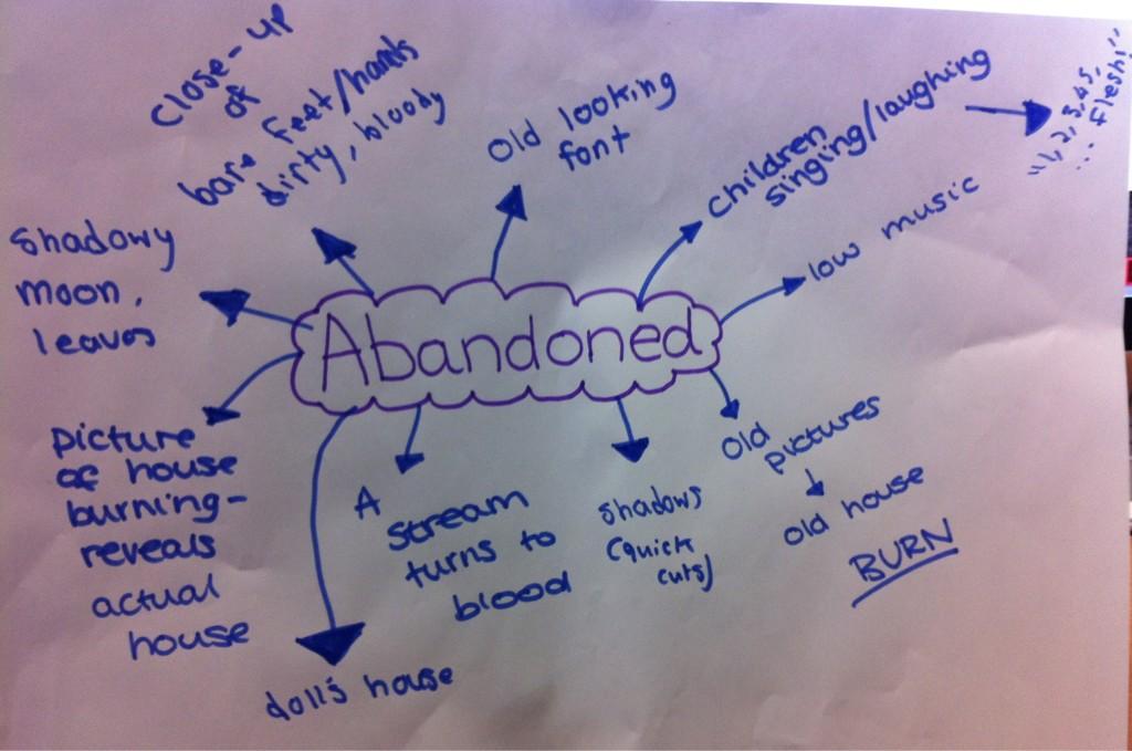
- We decided that we were going to change the name of our film to 'Abandoned' instead of Orphanage as the comments we got back from the others when we presented out pitch were rather negative towards the name as it was unoriginal.
Feedback on pitch


From the feedback that we were given from the class, the
target audience we used for our pitch were around the correct age range
(12-25). Also the director that we used was suitable for our genre James
Watkins we looked into our director’s success in other films and the
budget, he has directed similar films e.g. The Woman In Black so we then
came up with a budget we thought would be suitable for our film. In near enough
every sheet we had ‘It definitely has potential’.
In the feedback I saw a repeated thing that didn’t work is
the name for our film ‘Orphanage’ it has been said to be original. Although we
struggled with coming up with a new title. Some people said that they were
confused with our storyline, as we didn’t expand on some of the main characters
like ‘Mildred’ for example she had a main role in the film, but she didn’t come
across as she did in the pitch that we gave.
They said that the actors/actress we chose weren’t recognisable enough
although we chose them as we thought they were suitable for our price range. Other
than that, I think that our pitch went rather well as we all had a role to play
and got a mixture of good and bad feedback.
Sweeney Todd
The title sequence begins looking animated. Animation may show us that it doesn't take itself seriously even though its about murder. Rain drops
of blood begin to come down, the sequence as a whole is very dark and features a lot
of dull colours although the colour red shines out brightly. The whole title sequence is full of dark colours the only other colour that you see is red which represents blood other than that the colours are rather basic, grey, black and a moldy green. The use of dark
colours make the audience think that something bad is bound to happen
especially as when blood is used dropping onto a window the contrast between
the two adds to the fact that death will probably feature in the film. The typography used looks as if it is set in the olden times
as it looks like an old newspaper type font. The way the titles appear is in order
of whom is key to the film. The names that appear all fade in and fade out
which could create an eerie atmosphere for the audience, where they fade out
this could foreshadow that the actors characters will die or disappear. Also all the typography used in the title sequence is written in write except for the name 'Sweeney Todd' which is in red, this is given us an inside look that he is the reason for death as the red makes us think blood. The typography is pretty basic the whole way through. By the way the typography is shown it is showing us that it is based in the olden days.
At the beginning of the title sequence we are shown a
tracking shot of the tops of houses, the houses have working chimneys with
smoke coming out of them this shows us that the film will be set many years
back. There is enigma created when we see the pictures on the wall of the two woman, this is then leaving the audience thinking 'Who are they?'. The sequence is going in order like its some sort of recipe. The chair is a main feature in the title sequence which can
show that this will be a main part in the film. Blood drips onto a set of cogs enabling them to turn, this
shows that blood will be needed in the film also this could mean that 'Business runs on blood'. the blood also suggests the genre
of the film which would be horror. We are shown an oven with big flames in, the fire could foreshadow death. The music starts off as mellow but becomes louder towards
the end of the title sequence, this makes the audience feel as though something
bad is bound to happen. The music to the title sequence tends to build up tension. You can hear the thunder in the background this represents a dark and scary atmosphere. By the way the title sequence has been shot, this is then pulling the audience in and showing them what the film is about. In the sequence we can see that there is a trapdoor, this could show us that there is secrets that he is hiding as no-one has been down there.
The sequence as a whole is very dark and the use of white
typography seems to be the only pure colour. The text and dullness of the
sequence work together with the blood and connotations of death to help
establish the horror genre.
Subscribe to:
Comments (Atom)