We decided that we weren’t going to change the typography for our title sequence, although in the end we decided that we would change the font so we went back onto dafont.com as in our feedback the audience said that the font we had originally used was too blurry and they found it hard to read, no matter what colour it was. We found a new typography called An Unfortunate Event as it still fits in with eerie effect within our title sequence. We agree with the feedback given to us with the white font so we have kept it that colour although we changed the typography we also had a look at a font called Charles S we did try it out within the title sequence but we felt it wasn’t as connected to the horror genre as much as the other font so we decided in the end to go with the first choice as we felt it fitted in better than the second one.
Labels
- 180 rule (1)
- Abandoned (24)
- Analysis (3)
- Classwork (1)
- editing (3)
- feedback (4)
- fight sequence (1)
- Information (1)
- journal (2)
- Powerpoint (1)
- production (1)
- research (2)
- Shot Reverse Shot and Match On Action (1)
- storyboards (1)
- title sequence (1)
Links
Thursday, 7 February 2013
Re-Edited Title Sequence
We decided that we weren’t going to change the typography for our title sequence, although in the end we decided that we would change the font so we went back onto dafont.com as in our feedback the audience said that the font we had originally used was too blurry and they found it hard to read, no matter what colour it was. We found a new typography called An Unfortunate Event as it still fits in with eerie effect within our title sequence. We agree with the feedback given to us with the white font so we have kept it that colour although we changed the typography we also had a look at a font called Charles S we did try it out within the title sequence but we felt it wasn’t as connected to the horror genre as much as the other font so we decided in the end to go with the first choice as we felt it fitted in better than the second one.
Wednesday, 6 February 2013
Class Feedback
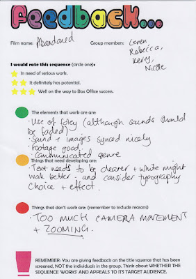
After screening our title sequence to the class we got audience feedback. We got a range of good and bad feedback which is good so it then is giving us the opportunity to improve what needs improved the class mostly mentioned about the camera being very shaky in some shots which we agreed with as we already knew that there had been some shots that weren’t as successful as others although we did try and resolve these faults by trying to overlap the shots when we were editing all the clips together. In our storyboards we mentioned that we were going to feature a nursery rhyme into our sequence although when we were editing we decided that we didn’t think that it went well with the shots we had done and we felt that it made the sequence seem cheesy. Although the class have mentioned that they think that we should include it into the sequence, they said that it would make it more creepy or that we should include some children giggling to give it that eerie atmosphere, but as a group we are still unsure of what our decision is going to be.
Tuesday, 5 February 2013
Editing
We have gone back into our title sequence and started to change the colour of the font as that was the main fault with the feedback that we got back from the class so we went for a white so it was easier for the audience to see, the red was foreshadowing the horror genre and we didn’t want the audience to loose sight of the horror genre we were going for with our title sequence. We have kept the same font ‘Nervous’ for now and we can then see the feedback we get from the change in colour. However, for the last word in our sequence is the films title we decided that we were just going to change the brightness of the red as the white made the clarity even worse. We have shown our new edited sequence to some students and they have said that they are able to see the font a lot more clear than what they could when it was red, we are hoping to keep the original font as it connotes the horror genre and we think it fits in well with the sequence itself.
Monday, 4 February 2013
Feedback Editing
Since we got the feedback from our blog we have started to
look at different fonts we could use as we have been told that the font colour
should be changed as it wasn’t the right colour. This was the main fault that
the class pointed out that needed to be changed also they mentioned how the
typography itself should be re-positioned. We are trying to find another font
type that will fit in with our genre type but we also didn’t want it too seem
too boring or fit into another genre, it is difficult trying to find a font
that we like and that the audience will like. We have found Supernatural Knight
but we felt that it might come across as too boring, we have also found Ed Gein
although we think that this goes totally out of our genre and into more of the
slasher genre and we want to make sure that the audience don’t forget that the genre
we have gone for is the horror genre for our title sequence.
Subscribe to:
Posts (Atom)
.jpg)


.png)

